I once had an automated email sequence that ran perfectly for six months. It nurtured new leads from our marketing efforts at JvG Technology, warming them up for our sales team. Then, one Tuesday, it stopped working. A subtle API change in our CRM had broken the connection. The leads were still coming in, but the automation that was supposed to engage them went silent.
We didn’t notice for four days.
Four days of silence for dozens of high-value prospects. That’s an eternity in B2B sales. The immediate problem was a technical glitch, but the real failure was systemic: we had automated the work but failed to automate the supervision.
This is a common paradox in modern business. We embrace automation for its efficiency, yet we often overlook the new kind of fragility it introduces. Research shows that while 70% of businesses consider marketing automation critical, a staggering 58% of marketers cite the sheer complexity of implementation and strategy as its biggest obstacle. And it’s within that complexity that things silently break.
That failure led me to develop a simple but powerful concept I now apply to all our automated systems: the Anomaly Dashboard.
From KPI Overload to Anomaly Detection
Most dashboards are designed to show you Key Performance Indicators (KPIs) like traffic, conversion rates, and cost per lead. They tell you what’s happening. But they often fail to tell you what isn’t happening that should be, or what’s happening that shouldn’t be. They require you to manually hunt for the problem in a sea of data.
An Anomaly Dashboard works on a different principle. Its job isn’t to display numbers; it’s to flag deviations. It answers one question, instantly: „Is the system behaving as expected?“
Instead of tracking dozens of metrics, it focuses on a handful of critical ratios and flags any significant departure from the established norm. It’s less of a reporting tool and more of a smoke detector for our digital operations.
The core idea is to create a lightweight layer of human oversight that complements the machine’s efficiency. This system allows one person to supervise complex marketing automation systems in just a few minutes a day.
The Four Pillars of Our Anomaly Dashboard
When I first started sketching this out, the goal was simplicity. If it was too complex, it would never get used. The entire system had to fit on a single screen, providing an immediate „all clear“ or „red flag“ status.
[Image 1: A conceptual sketch of the anomaly dashboard on a whiteboard, showing simple charts with highlighted ‚red flag‘ zones.]
Here are the four core anomalies we track, which cover the most common failure points in our funnels.
1. Funnel Inflow Anomaly (Traffic to Lead)
This is the first gate. We know that for a given channel—say, a specific Google Ads campaign—we have a stable average conversion rate from a click to a new lead.
Metric: (Number of Leads / Number of Visitors) per channel.
What it catches: A broken landing page form, a tracking pixel that stopped firing, a sudden change in ad-targeting that’s sending low-quality traffic, or a broken link in an ad.
Why it matters: A drop here means the top of your funnel is broken. No matter how good the rest of your system is, if no leads can get in, the entire machine grinds to a halt. This is a foundational metric when you’re building a scalable lead funnel.
2. Quality Anomaly (Lead to MQL)
Not all leads are created equal. We have an automated scoring system that qualifies leads (MQLs) based on criteria like company size, industry, and engagement. The ratio of raw leads to qualified leads tends to be very stable.
Metric: (Number of Marketing Qualified Leads / Total Number of Leads).
What it catches: A sudden influx of spam submissions, a bad lead magnet attracting the wrong audience, or a broken data enrichment process that fails to score leads correctly.
Why it matters: Data quality issues can slash marketing ROI by as much as 20%. This metric is our first line of defense against wasting our sales team’s time on unqualified prospects. It protects the integrity of our pipeline.
3. Experiment Anomaly (A/B Test Variance)
We are constantly running A/B tests on landing pages, ad copy, and email subject lines. A well-designed test can improve conversion rates by up to 49%, but a broken one can quietly burn through your budget.
Metric: Conversion rate of Variant B vs. the Control (Variant A).
What it catches: A new landing page variant with a critical bug that prevents form submissions, or an ad creative that is dramatically underperforming.
Why it matters: Instead of waiting a week to check the results, the dashboard flags a statistically significant underperformer within 24-48 hours, letting us turn it off immediately.
4. Cost Anomaly (Cost Per Acquisition)
This is the ultimate financial safeguard. For each stage of the funnel, we have an expected Cost Per Acquisition (CPA).
Metric: (Total Ad Spend / Number of Conversions) per campaign.
What it catches: An ad campaign with runaway spending due to a bidding error, an ad set that has hit audience fatigue and is no longer converting, or a competitor driving up auction prices.
Why it matters: This directly impacts the bottom line. It’s surprising how many businesses struggle with this; only 24% of marketers feel confident in their ability to measure ROI. This metric makes the financial performance of our automation visible at a glance.
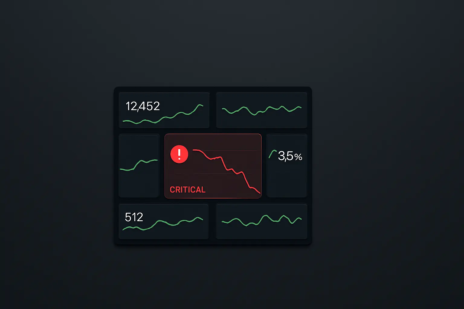
[Image 2: A screenshot of a clean, minimalist dashboard in a tool like Looker Studio or Geckoboard, showing a few key metrics with one clearly marked as an ‚anomaly‘.]
The Human in the Loop: From Data to Decision
The purpose of this dashboard isn’t to create more data. It’s to trigger a decision. When a metric turns red, it’s a signal for a human to step in and investigate. The machine flags the problem; the human solves it.
This approach transforms the role of a marketer or operator from a data analyst into a system supervisor. It embraces the principles of data-driven decision-making without the overwhelm.
Building this system has fundamentally changed how we scale our marketing. We can add more campaigns, more channels, and more automation with confidence, because we know our „smoke detector“ is always running in the background. We can trust our systems without blindly relying on them.
Frequently Asked Questions
What’s the main difference between an Anomaly Dashboard and a standard Google Analytics dashboard?
Focus and purpose. Google Analytics is a vast ocean of data for deep exploration—it’s fantastic for research. An Anomaly Dashboard is a simple signal light. It’s not meant for analysis; it’s designed to answer one question in under 30 seconds: „Is everything operating within its normal, healthy range?“
What tools do you use to build something like this?
The tool is less important than the logic. You can build this with Google Looker Studio (formerly Data Studio), Geckoboard, Databox, or even a sophisticated Google Sheet. The key is to connect your data sources (Google Analytics, your CRM, your ad platforms) and set up rules that compare the last 24-48 hours of performance against the 30-day average.
How do you define what an „anomaly“ is?
We use a simple but effective rule: an anomaly is a deviation of more than two standard deviations from the 30-day moving average. For example, if our landing page normally converts at 5% and the standard deviation is 0.5%, our „anomaly“ threshold would be triggered if the rate drops below 4% or jumps above 6%. The key is to set a range that’s wide enough to ignore normal daily fluctuations but sensitive enough to catch a real problem.
How often should someone check this dashboard?
That’s the beauty of it. It should be the first thing you check for five minutes every morning with a cup of coffee. If all the lights are green, you can move on with your day, confident that your automated systems are working. If something is red, you know exactly where to focus your attention.
Supervising the System
Automating a process is only half the battle. The other, more critical half is building a reliable system to supervise it. The Anomaly Dashboard is my solution—a simple, visual contract between human oversight and machine execution. It ensures the systems we build to scale our business don’t just run, but run right.